

DAS „RE-EVENT“
Concept and Design / Corporate Design
5th semester / Wintersemester 2017/18
Student: Samuel Löwe
Supervisor: Fred Oppitz
published on: www.samy-loewe.com
The basic function of any corporate design is primarily the allocation of an identity. The logo on a cornflakes packaging, the illuminated lettering at the gas station or the animated intros of the films and TV series all provide a picture in our heads.
For the recognition value enormously important I asked myself in this work the question whether it could not be done differently. What should a design look like that does without the rigid specifications and has several names and logos?
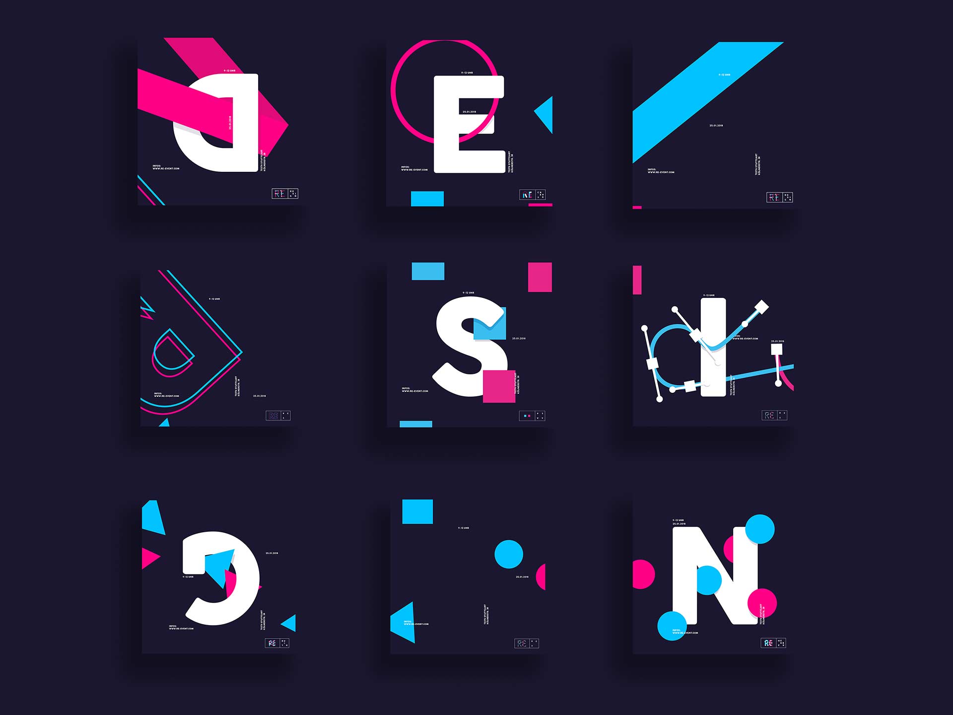
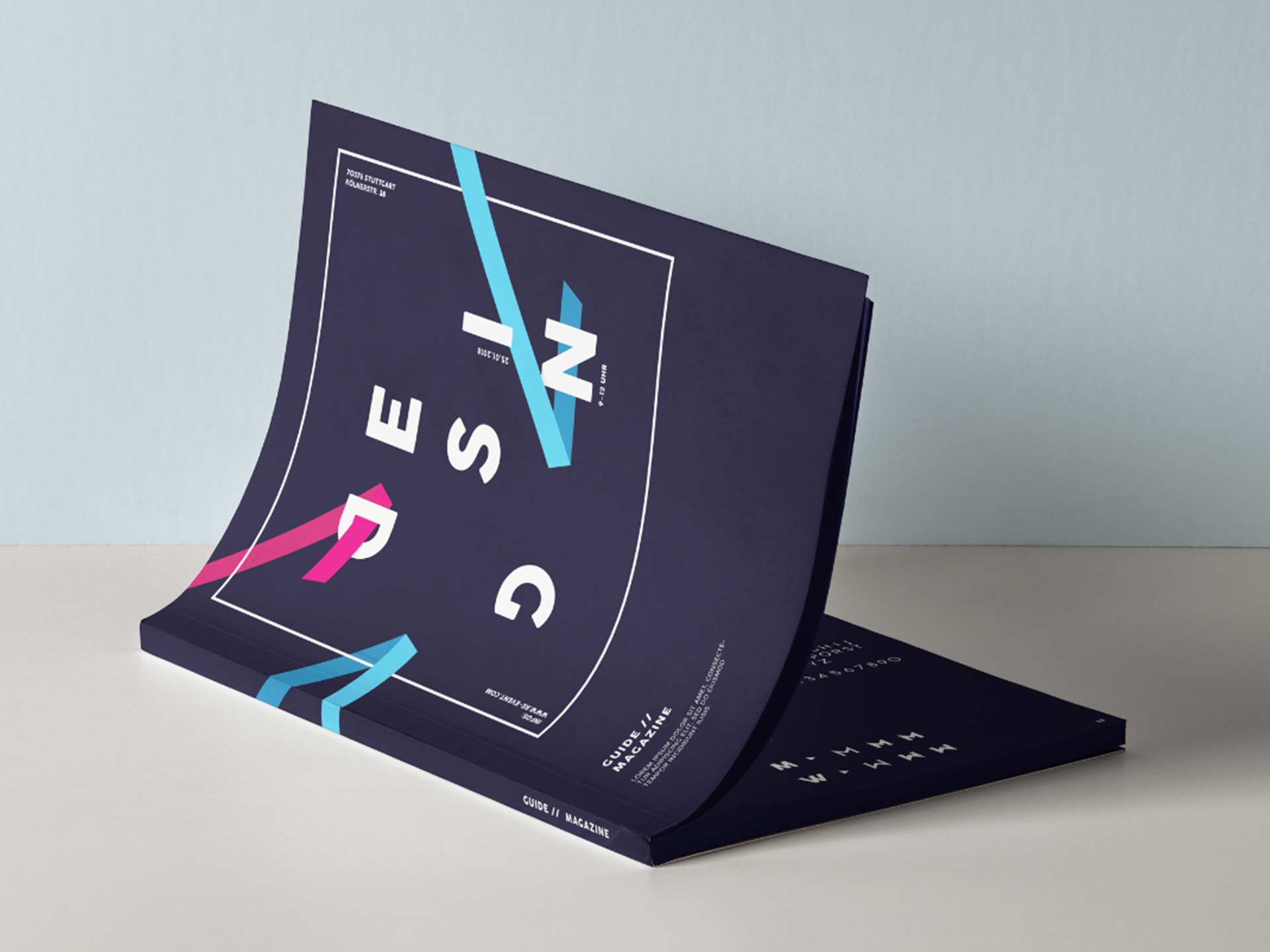
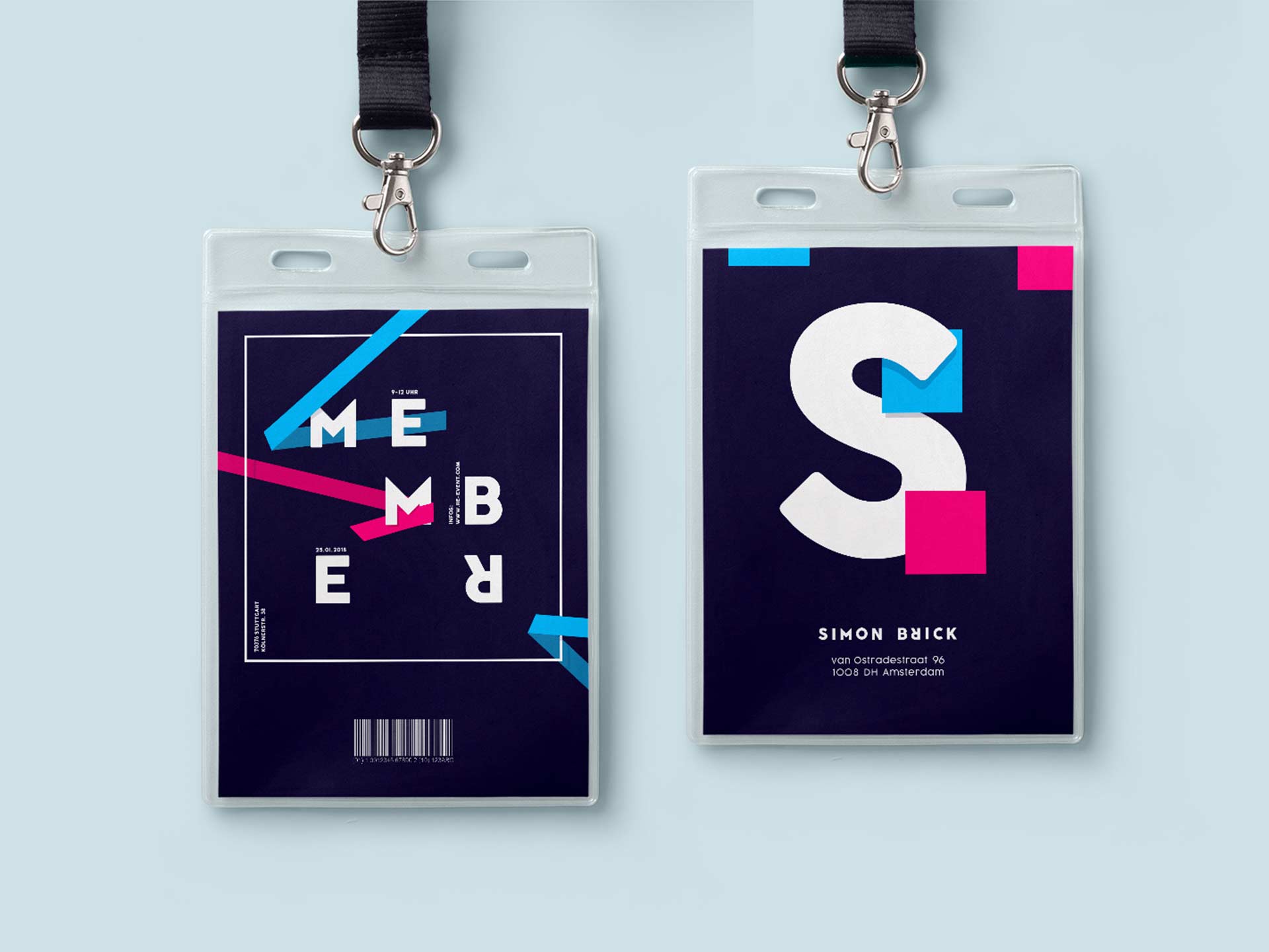
Which advantages and disadvantages does this bring with it and which other elements such as colours, typography or forms come to the fore? These exciting questions led me on a journey to the “RE-Event”. A corporate design with a variable logo grid, which shows different “RE’s” on the one hand, and different topics on the other hand.
This results in hundreds of possible combinations and the brand is virtually infinitely diverse. The disadvantage could be that the brand is no longer recognizable or unique features are missing…but is one the only one with an infinite design not unique?
Decide for yourself.
Samuel Löwe