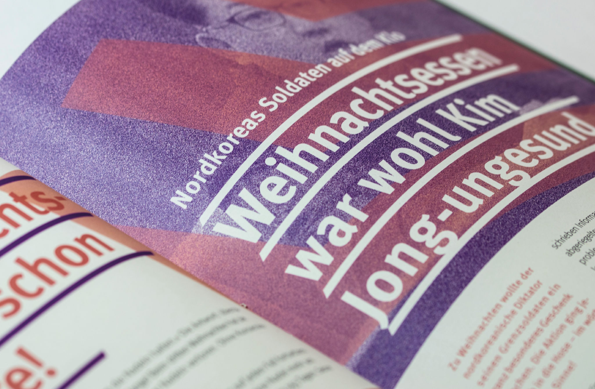
Interaction and influence between form and content in editorial design
Contents of “BILD” and “ZEIT” in a new guise
Concept and Design / Editorial Design
6th semester / Winter Semester 2018/19
Student: Johannes Schilk
Supervisor: Prof. Mark Schmid
The editorial area is largely determined by two major factors: The content and, of course, the activity of preparing it creatively. In the course of time an enormous number of print media developed and for each genre design norms and characteristics developed. Youth magazines are colourful, large and gaudy, serious trade journals rather simple and reserved. Undescribed laws usually have their reason and without a doubt countless designers have already dealt with any medium independently of each other and have mostly come to similar results. These principles certainly make life easier for us as designers so that we don’t always have to start from scratch, but we can experiment with the oldest consumer habits when we get the chance. The perfect form can only exist for the moment, because the needs and requirements change. Also, design always lives from the new, the surprising, and this cannot stop. In order not to sink into boredom, we have to constantly question our standards and reanalyse how our design works. How do we influence the perception of the content we design?
Through playful studies with form and content, interesting new results are to be created in this project in order to analyse them.
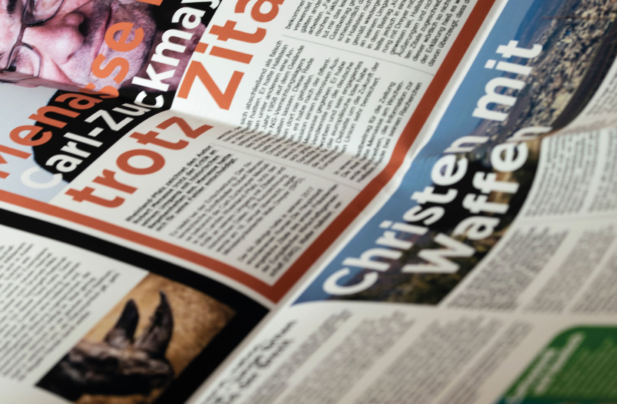
The best-known print medium in Germany, in which form and content seem to be completely homogeneous and firmly linked, is undoubtedly the BILD newspaper. The loud, flat block layout, which makes full use of the given space, the large, bold typography, provocative images and, of course, the striking headlines. Whatever one may think of it, BILD is a coordinated product. But what happens if a few factors are changed in this immediately recognizable form? Can the newspaper appeal to other readers?
The first study of this project is dedicated to changing the form, while the content remains completely untouched. Since the previous form describes a certain extreme, it would now be obvious to look for the opposite extreme: a quiet, unobtrusive layout, lots of white space, small fonts, small, interestingly arranged pictures. But the results would probably be all too predictable. A much more interesting task would be to try not to turn the obvious knobs (font more restrained, images smaller, more space, less colors), but to try to change the appearance by other, smaller adjustments.
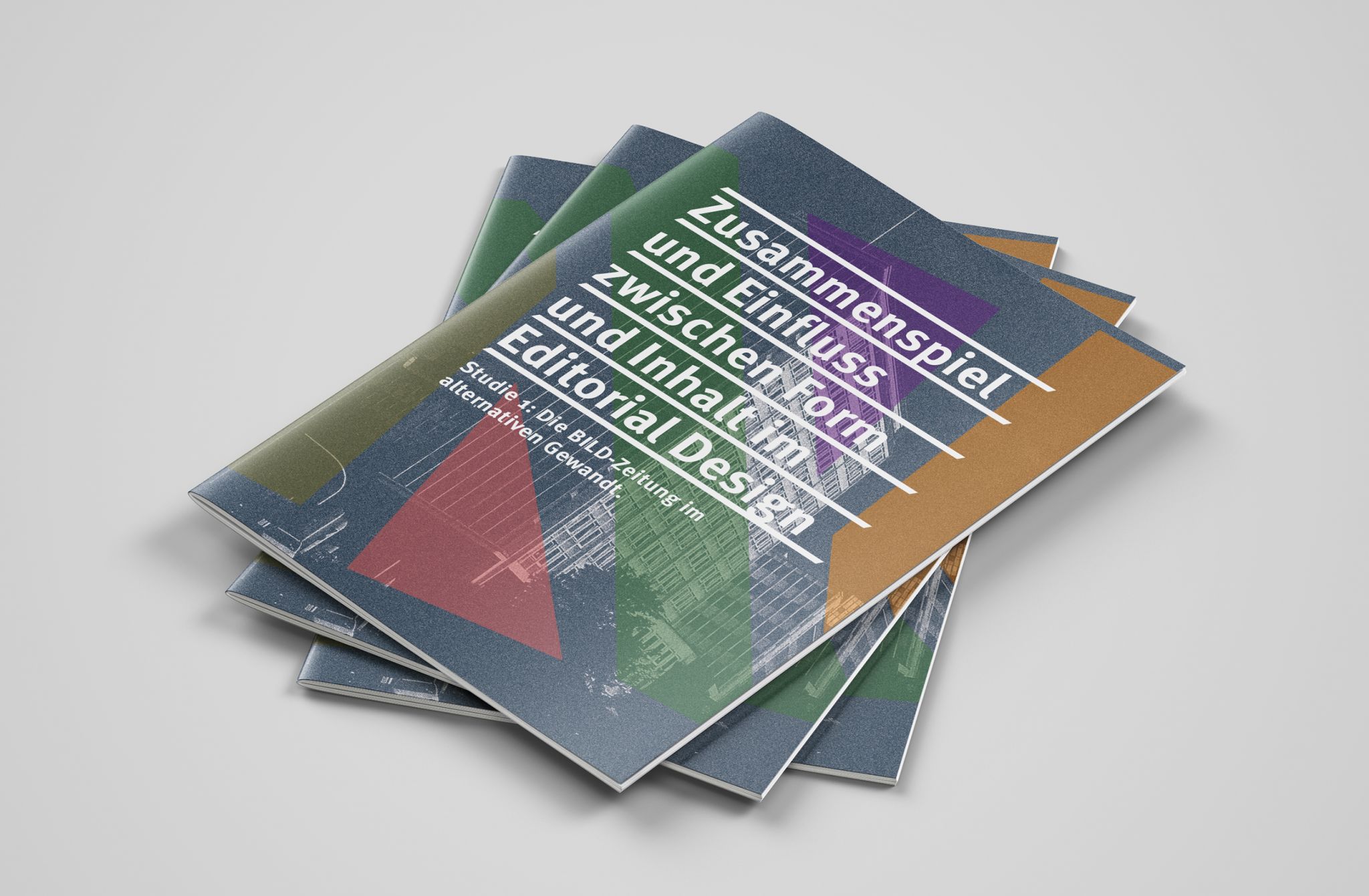
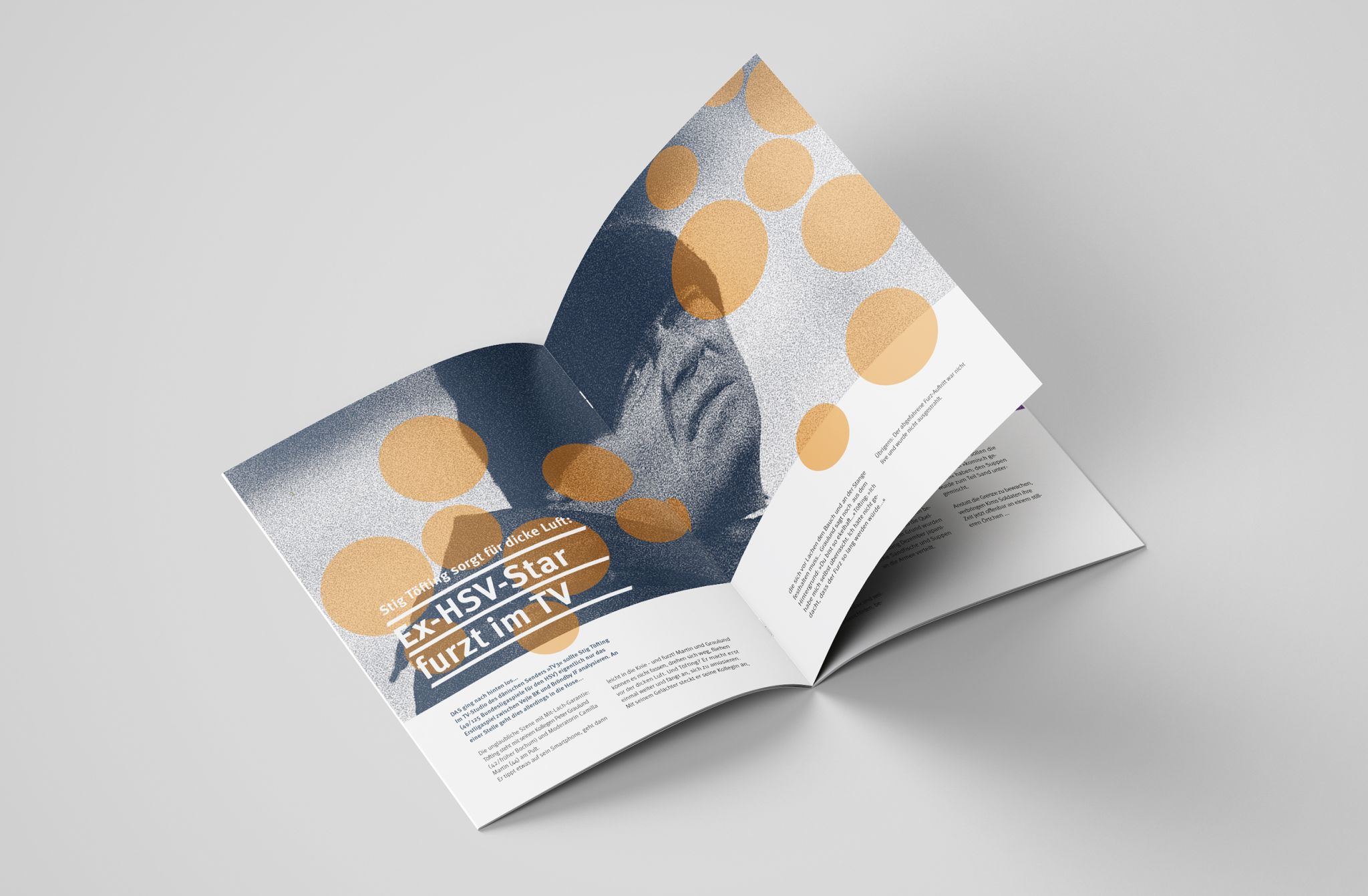
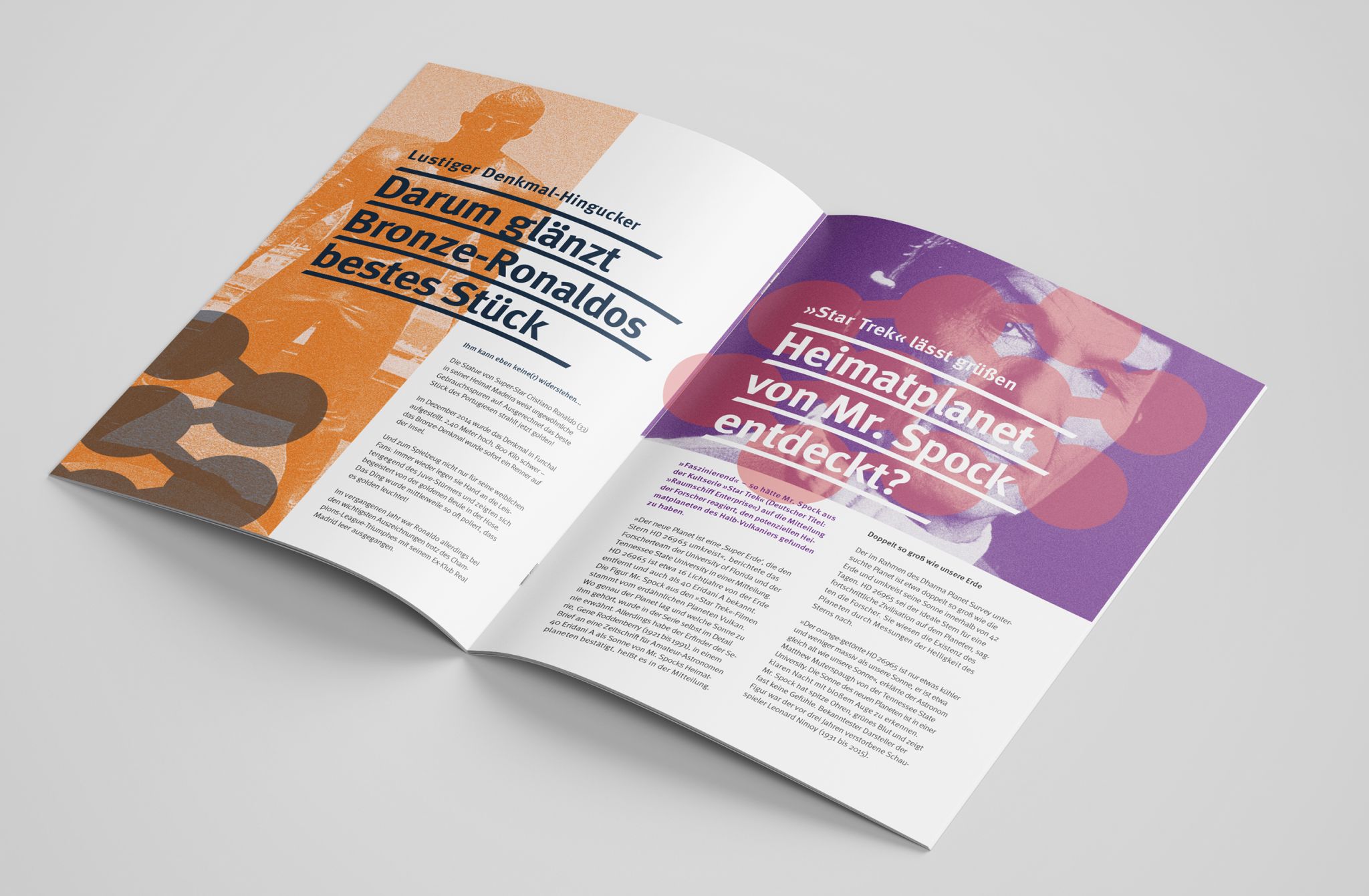
The BILD newspaper in its alternative guise should try to appear somewhat more modern and at the same time more serious in order to appeal to a new readership. The format will become a classic DIN A4 with thread backstitch binding, a 300-gram cover and recycled paper to give the magazine a higher quality character. Articles and pictures are all taken from the original and each fill a single or double page. In order to be able to continue using the original images over a large area without appearing cheap, they were subjected to a noise filter, dyed and combined with transparent, geometric shapes. The magazine uses three color pairs that characterize the BILD sections Entertainment, Sports and News. The headlines are still large, but kept in the characterful and charming Meta Pro, no longer in majuscule throughout and underlined and overpainted by wide lines that are chamfered at the corners to harmonize with the more angular typeface. The continuous texts move in one to three columns, variably in a twelve-column grid, with airier line spacing and a continuous fluttering pattern. The new look is good for the content and could also appeal to a modern, open, open-minded target group. If the headlines aren’t quite so drastic, you could take a look, but at the very latest when you look more closely at the content, most of this group would probably be deterred. So what happens now if we approach and change the content instead of the design? If we implement highly complex technical content into the existing layout, the whole thing won’t work, of course, because the text-to-picture ratio alone won’t do. But if we take content that deals with the same topics as BILD, but is prepared differently, for example from “Zeit”, the whole thing works much better. The system seems to work well, but without the provocative statements and the more reserved images of the “Zeit” editorial team, the product loses all appeal. It’s too boring to attract attention and too formally inappropriate to appear serious.
The interplay of form and content is thus the most central point in reaching a certain target group. The one cannot do without the other. One of the elements must always arouse interest, but must not make any false promises in order to keep the interested party afterwards. The target group is always on the lookout for certain creative norms and without partially fulfilling them, it is impossible to reach them. Smaller, up-and-coming media can usually not afford this risk without losing readers, and the effect on the rigid standards is small anyway. Therefore, it is precisely the designers of large media, with an already existing, loyal customer base, who have the responsibility to innovatively change their form in order to keep print media interesting for the masses.